Google: Mobile Is the Future, and the Future is Now
Soon businesses without a mobile-optimized website will start feeling the squeeze on Google.
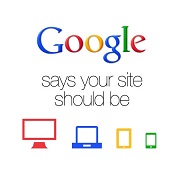 Google wants what its users want: sites that are mobile-ready.
The search giant announced that as of April 21, 2015 the mobile-friendliness of your website is now a significant ranking factor. This should come as no surprise since mobile traffic outpaced desktop traffic last year, and Google’s goal has always been to provide the best search experience for its users.
Google had already begun moving in this direction. In 2014 it introduced mobile-friendly labels in search results to identify websites that work well on mobile devices – or, conversely, to alert users to sites that might make mobile browsing difficult. It was up to users to decide whether or not it was worth the click.
With the new algorithm, Google makes that decision for you. If your site isn’t mobile-friendly, Google is less likely to display it when mobile users search for your products or services. Even if your site is potentially more relevant than your competitors’.
Test Your Website and Optimize
Not sure where your site stands? Here are some tools that can help you assess its current mobile-readiness:
- First, analyze your site using Google’s free mobile test.
- Even if your site gets a positive score, some internal pages on your site might not be optimized for an ideal mobile experience. For example, you may need to remove or update content that isn’t supported by mobile platforms, like Adobe’s Flash animation. To dig deeper, use the mobile usability report in Google’s Webmaster Tools.
- Finally, mobile pages need to load fast. Check load times for key pages where you’ll be driving traffic with Google’s PageSpeed Insights.
Using Responsive Design
If your website doesn’t fare well after running the gauntlet above, it wasn’t designed with mobile in mind. And there’s really only one option: to implement responsive design, which is Google’s preferred approach.
Responsive design automatically resizes the content on your site to fit the user’s screen. No matter how they view it, or on what device, they’ll always get an optimal user experience.
For many businesses, the upgrade to a responsive website will mean an investment they hadn’t planned for. But not taking the plunge now could mean a significantly higher cost in lost traffic and business over the long-term.